
Mission Beach-based economist Pete Faulkner has great coverage of the latest international short-term arrivals and departures data for August from the ABS in his latest post:
International arrivals still growing; QLD gets its mojo back while Tassie slows
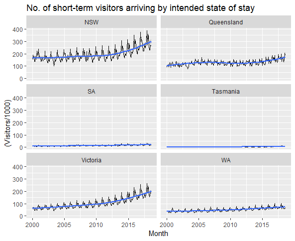
As Pete notes, while the resurgence has been impressive (see the chart array above), we still lag Victoria:
When we consider the data on state of intended stay (which we Trend based on the unadjusted original ABS data) we see that year on year growth for Queensland is at its fastest pace in more than 2 years (+10.4%) while it’s up 6.8% for the annual total. Growth in the Sunshine State continues to lag that in Victoria (+11.3% y/y and +7.9% annual) as the gap between the two states widens further.
Given international visitor numbers to southern states are still growing strongly, we’re not seeing much of a recovery in Queensland’s share of total international short-term arrivals, although at least it has stabilised and no longer appears to be declining (see the chart array below).
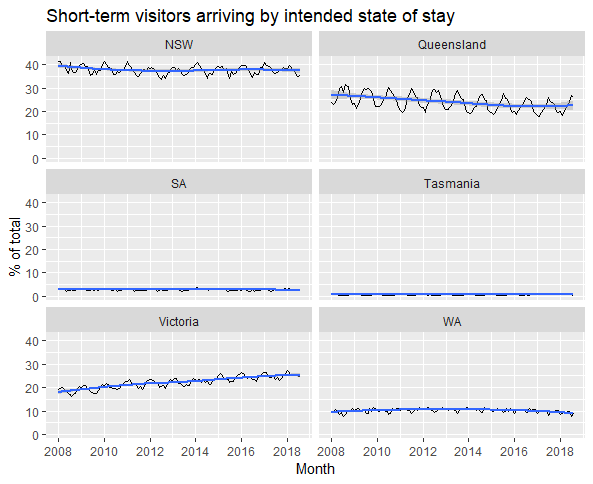
Note that short-term arrivals are defined as those staying for one year or less, meaning many students would be included. It’s very likely international students explain a large part of the surge in short-term arrivals in southern states. Also, it should be borne in mind that, even though short-term visitors may nominate one state as where they intend to stay on their passenger cards, many do of course visit other states, so we shouldn’t get too despondent about Queensland’s share of total arrivals.
Regarding country-of-origin, data for which are only available at the national level, as Pete observes in his post:
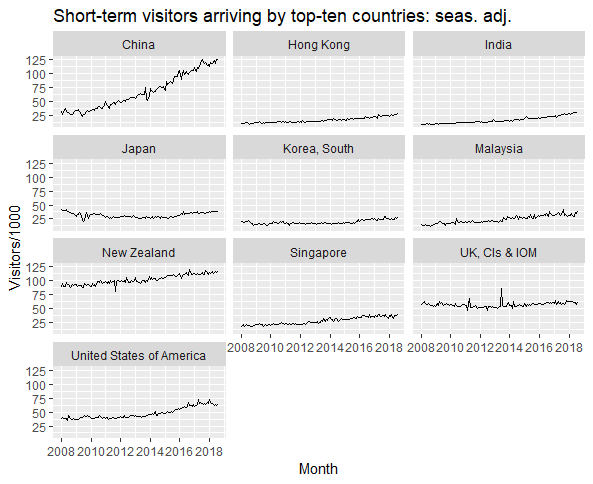
The growth from the Chinese market has continued to slow sharply (although it’s still growing) and is up 2.3% y/y (s.a.) or 2.6% y/y (Trend); the annual totals up 7.7% (s.a.) and 8.1% (Trend). While still strong these rates of growth for Chinese arrivals are now the slowest in 9 years.
China continues to be the number one source country for short-term arrivals in Australia, followed closely by New Zealand, with daylight between them and the next largest source countries, the US and the UK (see chart array below).
Note: I’ve produced all these charts using the Tidyverse packages in R. The development of the Tidyverse by R guru Hadley Wickham is the best thing to happen to data analysis since Microsoft Excel introduced the pivot table feature many years ago. If you want an introduction to the Tidyverse, see the excellent R for Data Science book by Wickham and Garrett Grolemund.
