
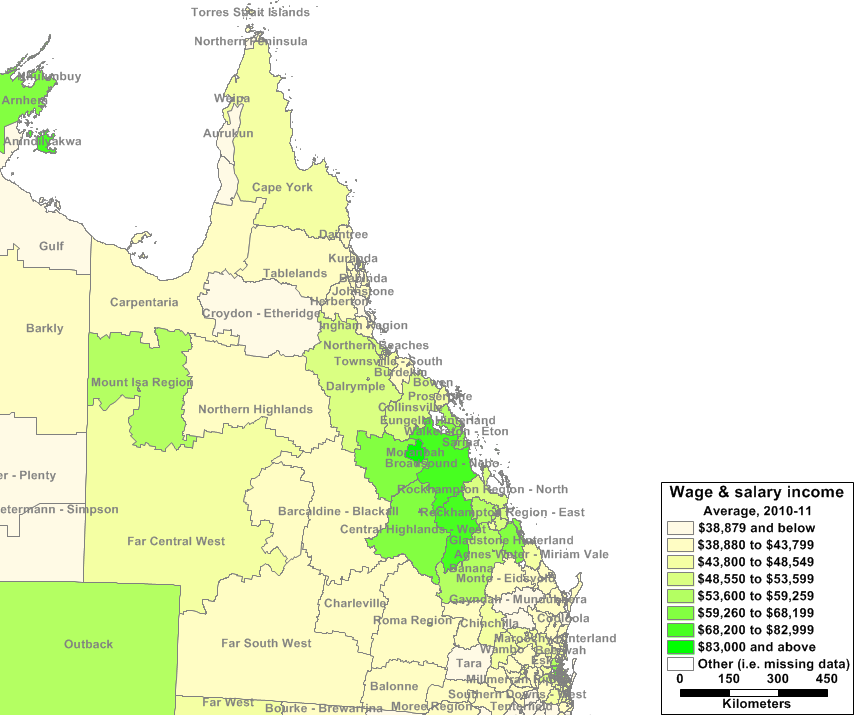
Average wage and salary incomes of residents of mining regions in Queensland rival those of residents in the Western suburbs of Brisbane, according to the ABS’s new small area income data (see maps below for the whole of Queensland and SEQ).
 SEQ closeup:
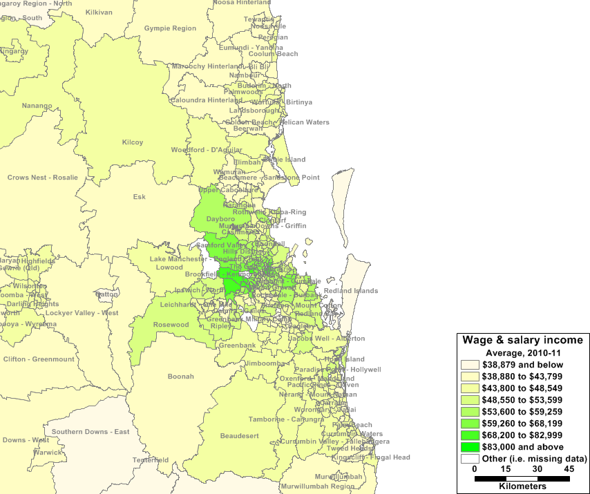 As would be expected, average incomes on the Gold and Sunshine Coasts are significantly lower than average incomes in Brisbane, which has a higher proportion of professional and managerial workers in its labour force.

Always interesting – couple of comments spring to mind.
1. People working in regional mining areas of Queensland deserve every cent they earn, considering daily summer temperatures regularly are in the 40C.
2. I realise that data ranges are probably sourced from any external source, but the highest range $83k and above, seriously most the graduates I know in engineering are starting on salaries over $90k. For the information to be infomative, they probably need a few data increments above $83k.
3. I know the Western suburbs always appear above average in your stats – but have you considered the Clive Palmer effect. Perhaps a few very high earners are skewing the average. Perhaps his billions are skewing the average – or is he an ‘average tax payer’ for taxation purposes. How do our median and average salary compare for instance ?
Thanks for the comment, Katrina, and my apologies for the late reply. A point to note which I should have included in the post is that the ABS average income figure is simply total wages and salaries income declared to the ATO divided by the number of wage and salary earners in the area (i.e. it includes part-time workers which means the average/mean figure may appear low as you correctly note. The median income figure reported by the ABS for Kenmore is actually $37K p.a., but probably isn’t meaningful due to part-time and full-time workers being lumped together.
Regarding the data ranges, they were chosen by my GIS mapping package as the best ranges to use in a thematic/heat map.
Interesting info on starting salaries in engineering, but is that just for graduates in the top firms such as SKM?
Hello. I am wondering how you made the maps.
Hi Andrew, there’s a link to the ABS data source in the article. I generated a map using a GIS package. I think at the time I was using Maptitude. Any GIS package or other package/app with GIS capabilities could do it.
Thank you Gene. I like the particular look of and detail in the maps, which I haven’t found elsewhere.